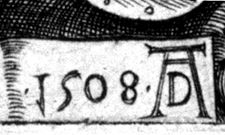
In Print« Love Those Letters! | In Print | Monogram Wizard » Monograms & MoreA Brief and Selective History of Monograms' "'Of course you know your ABC?,' said the Red Queen. 'To be sure I do,' said Alice. 'So do I,' the White Queen whispered. 'We'll often say it over together, dear. And I'll tell you a secret - I can read words of one letter! Isn't that grand? However, don't be discouraged. You'll come to it in time." from Lewis Carroll, Through the Looking Glass Although monograms sometimes include symbols and purely decorative elements, they almost always involve letters. It is impossible to consider monograms from a historical perspective without first considering the history of letters. An Overview of the History of Lettering Although the Greeks created the first true alphabet, the Roman alphabet, probably originating in the 7th century BC, was better organized and is the basis for the modern western alphabet. The earliest know example of Roman writing is from about 600 BC, with the lines alternating left-to-right, then right-to-left, effectively doubling the number of letters, since each letter could face either left or right, depending on the direction of the line. Only in the 1st century BC did lettering attain a sense of style and Roman capital letters were used to great effect in inscriptions on architectural stonework. These were the letters that decorated the monuments, visible to passers-by in later centuries, and influential to Renaissance designers, who used them as models for letter style development during their own time. Roman letterforms have been called their greatest original artistic achievement. Two-thirds of Greek letter signs were rigid and angular, while only slightly more than half of the Roman capital letters were straight-lined, the severity of the straight letters complimenting the rounded forms of the others. The use of the finishing stroke (or serif) on vertical elements gave the lettering a distinctive regularity and a strong base line. New styles developed naturally. The Rustic style (named by an 18th-century scholar who considered it somewhat primitive), was more fluid in nature and easier to write rapidly. The late 3rd century saw the development of the Uncial style (also named in the 18th century), even more rounded in form. The Uncial script, especially common in early copies of the Bible, may have been intentionally different from Roman styles, which was considered pagan by scribes of the time. The Roman alphabet was reintroduced to Britain by Christian missionaries in the 4th and 5th centuries. In continental Europe, writing at the time was unconventional, often very complicated and stylized, and generally illegible today. Manuscripts were often written as one continuous stream of characters, either because it was considered that intervals marred the beauty of the line, or because it required more physical effort on the part of the scribe to lift the pen from the paper. During the 7th and 8th centuries, the drawing of ornate and decorative letters became well established. Lettering became a starting point for all kinds of other artistic expression and letters began to be approached as forms of representational drawing, frames for other illustrations, often very ornate in nature. While eastern cultures have always considered writing to be a form of drawing, this tradition was only approached in the west during the Middle Ages, when artistic expression took precedence over legibility. With the reign of Charlemagne (768-814) some order returned to lettering styles and small, somewhat rounded letters prevailed. Following a royal decree, writing improved and the use of a lettering model was developed by the emperor's counselor, the Englishman, Alcuin of York. Known as the Carolingian style, it became a unifying element in Charlemagne's Holy Roman Empire. The Carolingian style flourished until the 12th century, when it was effectively replaced by the Gothic, or black letter styles ("black letter" referring to the density of the letter forms, which, grouped together as text, made the page appear quite dark.) This form evolved gradually and by the 13th century had developed into the full black, or Old English letter. Gothic and Old English capital letters were often large and elaborate. An increasingly larger segment of the population could read and the audience for written work, both scholarly and secular, continued to grow. The mid-15th century brought the invention of printed books, including the Gutenberg Bible, a development that was not universally applauded. In his book, In Praise of Scribes, the abbot Johannes Trithemius lauded writing over printing, which he felt encouraged monastic scribes to practice diligence, keep busy, and was a better method of learning the scriptures being written. Ironically, his book was printed. During the 15th and 16th centuries, designers of mechanical type no longer tried to imitate the look of manuscripts and their work took on more regular forms. In Italy, which quickly became a center of influence, more angular Roman letters were "reinvented" and lent themselves to more rigid cast metal forms. Several additional letters, including J, U (previously considered interchangeable with V), and W found their way into common usage. Many of the best artistic talents of the day turned their attention to designing alphabets, based on balance of dimension and geometric formulas. Albrecht Durer is perhaps the best known. The italic type style was introduced during this period by Aldus Manutius and other Old Style Roman typefaces, often with a less mechanical feel, were introduced by typecutters such as Christophe Plantin and Claude Garamond. Toward the end of the 18th century, new styles were introduced by the English printer John Baskerville, featuring greater contrast of line widths, thinner serifs, and a lighter feel. These styles were met with early criticism and many claimed they were difficult to read and even caused blindness. In a letter to Baskerville, Benjamin Franklin reported that he had tested one critic by referring to a more established style as a "Baskerville" sample, at which the critic damned it as much inferior, though it was the same style he had praised when it was correctly labeled. Within a few years, another style developed, referred to as Modern. It was distinguished by great contrast between thick and thin strokes, straight, very thin serifs, and narrower, more vertical letters. Two representative typefaces are Didot and Bodoni, named after their respective designers. Styles changed again in the 19th century, a great era of decoration and advertising. Posters and placards replaced books as the printer's major product, with many exaggerated styles appearing as display typefaces. These unusual styles included letter forms composed of intertwined figures, and letters composed of shrubbery of all kinds. It was also common for multiple type styles to be combined in the same presentation. The Arts and Crafts movement, particularly as embodied in William Morris, reintroduced many older styles, developed new ones influenced by traditional typography, and emphasized a graceful approach and dedication to high quality. The 20th century has witnessed the revival of many traditional styles and the development of many new ones. A major type-style development of the first half of the century was the sans serif design - sleek, functional, modern, dropping what were considered extraneous features. The second half of the century has also seen the introduction of many variations on the same style (Light, Normal, Bold, etc.) With the introduction of computer-generated and computer-distorted styles, letters can now be manipulated in infinite variations. Monograms in the Decorative and Applied Arts For centuries artists have often marked their prints with an identifying monogram, which functioned instead of, or in some cases in addition to, a signature. The monogram might be incorporated into the design itself or was sometimes added later as a separate stamp. The publisher of the print and the printer also might add a monogram of their own as a means of identifying their role in the final work. These marks were usually creative variations on initials.
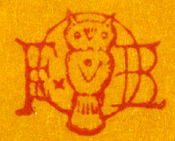
The practice of marking ceramics as a guide to their manufacture began in Roman times, but it was not until the16th century in Europe that fully-developed marking appeared, in part because the soft paste material of porcelain and glazing techniques lent themselves to greater detail. Since the late 19th century, these marks and monograms have been extensively documented by collectors; cataloguing carefully considers the individual monogram's decorative effect, but also functions as an aid to distinguishing fakes and forgeries from the real thing. The same technique, utilizing a stamp, was used on silver. Monograms and Ciphers
Monogram Styles
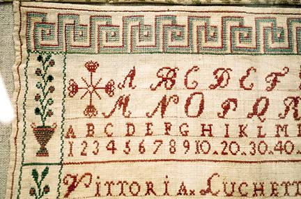
A regular stream of articles published between 1935 and 1943 encouraged the monogram as fashion, with the prevailing assumption that a monogram consists of an arrangement of several clearly distinguishable letters, taken from the world of typography. Once again, during World War II, the genre disappeared. In the 1950s and 60s, House Beautiful, American Home, Better Homes and Gardens, and Good Housekeeping, among other periodicals, all reported on monogramming in the home. From 1965 through 1980, it seemed out of fashion, though since 1980 articles on monogramming have appeared regularly. Some writers have handled the subject with an amusing and critical eye. Rosamond Pratt, in "Highly Personalized" (House Beautiful, May 1952), notes : " Women are in for a good many exhortations these days. They have been urged to get slim, to keep up with world affairs, to budget efficiently, to be abreast with the latest methods of child training, and to learn to serve smart dinner parties without a maid. Lately the distinction of being highly "personalized" has been pressed upon their attention. " This apparently depends largely upon having their initials or names engraved, embroidered, or stamped upon everything they own. Not only stationery and hankerchiefs are to be thus marked, but their nightgowns, slips, and other lingerie, their pillow cases (Mr. and Mrs.), bath towels (His and Hers), and highball glasses (Lucy and Lew). " But when every possession of a man or a woman or a couple is indelibly tatooed, it might suggest that the possessors are afraid that thieves are rampant, or that amnesia would overtake them and that they might forget who they are. . . ." In other words, everything in moderation. Monograms and Needlework In their simplest form, early embroidered monograms served as laundry markers, allowing linens to be washed without mixing them up. However, they are part of a much richer tradition than this simple definition suggests. Through the 15th century, much of the most ornate and accomplished needlework, including lettering and symbols, as well as rich ornamentation, was produced by nuns (and in some cases monks) for church vestments made from the finest fabrics and often enriched with gold and silver thread and the attachment of precious stones. Plain white vestments and altarcloths were also thoroughly embellished and monasteries were the repositories of knowledge regarding the technical execution of needlework. In the 16th century, during the Reformation, all such vestments and embellishments were removed from every place of worship. Under Henry VIII, religious orders were disbanded and those pieces not secreted away by nuns who fled abroad were torn apart in order to extract the valuable materials used to make them. Other bits were recycled by their new owners as household furnishings. Aside from the loss of the objects themselves, the designs used to make them also disappeared. Nuns were no longer being trained to teach these designs to others and the daughters of the upper classes, often previously educated in convents, were now being taught needlework at home. By the end of the 16th century, the new middle class of merchants and successful craftsmen, in addition to the traditional wealthy households, were demanding embellishments for clothing and home furnishing. Embroidery, including monograms banned for ecclesiastic use, was the height of fashion. Practically every fabric surface was embroidered. Sewing women were a necessity even in modest households, and small children were enlisted to learn embroidery skills. Their need to be taught the details of needlework gave rise to samplers, which are the best surviving record of the details of hand embroidery design. Samplers A sampler had multiple functions. To execute a sampler, a young woman (all known early examples were executed by women) needed to study stitch types carefully and understand their use in order to produce an example of fine craft. The sampler could be retained as a study piece or used by the needleworker as a catalogue from which to choose appropriate motifs and styles for later projects. Printed books were first produced in England in 1477, so prior to that time there were no printed designs for a needlewoman to follow. Instead, she would take a piece of linen, and on it record the stitches she knew, or the stitches she had seen used by other people, and add to these examples from time to time, often passing them on to her daughters as reference works. By the end of the 16th century there were enough pattern books to make the sampler unnecessary as a record of patterns, but they continued to be produced and served other important functions. In addition to instruction in needlecraft, samplers were used to teach geography (map samplers), moral values and obedience to the will of God (there are few samplers of the 18th and 19th centuries that do not contain at least one moral or scriptural passage), and to record family joys and sorrows (births and deaths) and all sorts of details of daily life. From 1502 onward, samplers as possessions are documented in wills, but there are no surviving examples prior to the late 16th century. By the late 17th century samplers became more square in format, often full-blown display pieces rather than practical records, and almost all contained embroidered calligraphy, including names, dates, verses, and noteworthy family news items. They also often included crowns and coronets, since the nobility employed many young women as ladies" or sewing maids. Most contained several styles of lettering. Very often they included the initials of each member of the family---paternal on the left side, maternal on the right---and were worked in black if the person was deceased.
Eighteenth- and 19th-century samplers, which were often done as presentation pieces, became more varied in design (Fig. 7). Many contained monograms consisting of one or more letters and research suggests that these may have been done as "friendship samplers." Samplers were often done at school and used as a "final exam" in one aspect of education in the domestic arts. This was particularly true in America where far more children were educated in schools than at home. In many cases the girl embroidered the name and place of the school as part of the sampler. The modern popular conception that samplers were worked in one type of conventional cross-stitch is incorrect. There are at least nine different types of cross-stitch and much thought seems to have gone into deciding which combination of stitches would be most appropriate. The modern popularity of monograms is based on the concept that everyone deserves to commemorate and decorate their own possessions. This is representative of a truly basic social revolution. Only since the 16th century, when a zeal for genealogy and family crests took hold, has it been fashionable for individuals to commemorate themselves by marking personal items with their own initials. Historically, it is much more common for an individual craftsman or domestic servant to master the detailed craft of needlework in order to apply someone else's initials to someone else's possessions. Monogramming, the process of applying initials to various surfaces by various methods, has always had a dual purpose. On the one hand, monograms identify the user, or the user's goods, and differentiate those things from the things of someone else. On the other hand, the use of initials has a clearly decorative function, without which there would be little reason to invest considerable time and patience in producing the best possible result. Even so, the result is often a matter of taste. " ... when Holmes, in one of his queer humours, would sit in an arm chair with his hair trigger and a hundred Boxer cartridges and proceed to adorn the opposite wall with a patriotic VR done in bullet-pocks, I felt that neither the atmosphere nor the appearance of our room was improved by it." from Arthur Conan Doyle, Sherlock Holmes: The Musgrave Ritual
Sources Clabburn, Pamela, Samplers (Buckinghamshire: Shire Publications, 1998). Coburn, J., "Make Your Own Monograms," Ladies" Home Journal (May 1935), 52:88-9. Firmage, Richard, The Alphabet Abecedarium: Some Notes on Letters (Boston: David R. Godine, 1993). Helmer, F., "Unique Monograms," Harper's Bazaar (September 1908), 42:886-7. Pratt, R., "Highly Personalized," House Beautiful (May 1952), 94:41+. Toller, Jane, British Samplers: A Concise History (Chichester, Sussex: Phillimore & Co., Ltd., 1980). | |||||||||||||||